DEGREE:
Master of Arts
Graphic Design


SCHOOL:
Lindenwood University,
St. Charles, Missouri
(Online)

YEAR COMPLETED:
Planned Graduation
December 2026

ROLE:
Researcher
Creative Director
Graphic Designer
TOOLS:
Adobe Creative Cloud
Qualtrics


DEGREE:
Master of Arts
Graphic Design

SCHOOL:
Lindenwood University,
St. Charles, Missouri (Online)

YEAR COMPLETED:
Expected Graduation
December 2026

ROLE:
Researcher
Creative Director
Graphic Designer

TOOLS:
Adobe Creative Cloud
Qualtrics
Project Overview
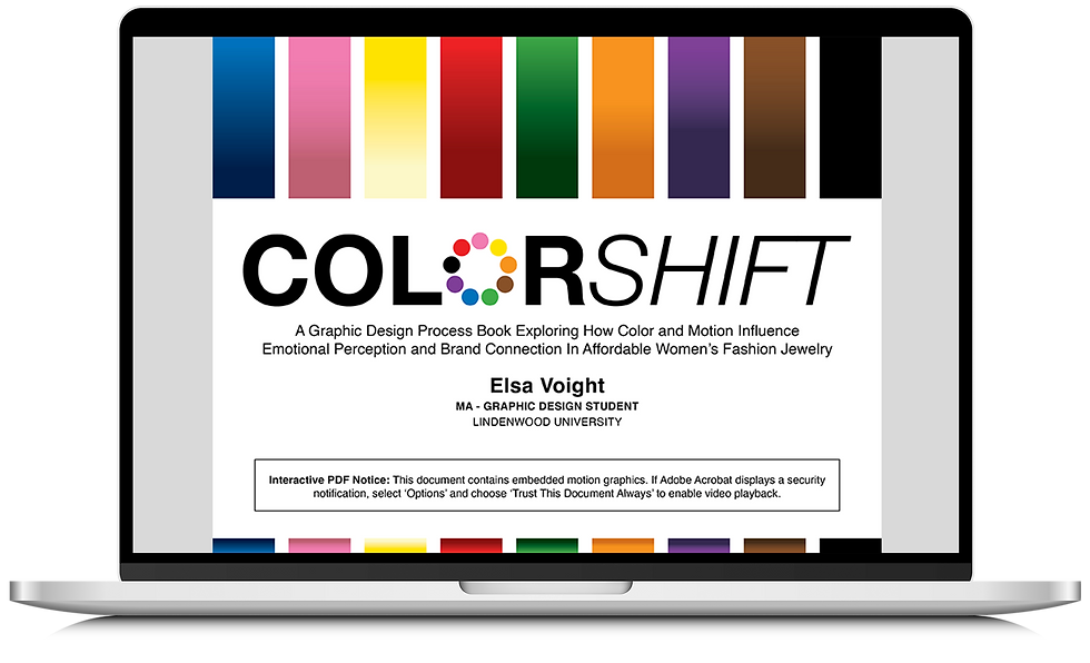
ColorShift explores how color and motion influence brand perception through a fictional jewelry identity system. This master's thesis project combines branding, motion design, and audience research to examine how intentional design choices shape emotional connection and consumer response.
Why I Chose This Project
With over 15 years of graphic design experience, I created ColorShift to explore the intersection of branding, color theory, and consumer perception. This project allowed me to step into a new industry, challenge my creative process, and expand my skills in developing cohesive, emotionally engaging brand systems.
Research
Through research on color psychology, branding, and emotional perception, this project explored how color influences audience responses to a consistent brand identity system. A quantitative study of Quanta & Co. informed the final designs and revealed how color and motion can shape brand experience.
Brand Development
Quanta & Co. is a fictional contemporary jewelry brand created to explore how color influences brand perception. Through research, visual exploration, and multiple rounds of logo development, I created a clean, adaptable identity system that maintained consistency while providing a controlled framework for studying the influence of color on brand perception.


Key Survey Findings: Red
-
Survey Participants: 55
-
Dominant emotions:
Aggressive, Exciting -
Brand perception: Bold but divisive
-
Best insight: A darker red would better support the brand's premium positioning.

Key Survey Findings: Orange
-
Survey Participants: 40
-
Dominant emotions: Confused, Playful
-
Brand perception: Creative but casual
-
Best insight: Orange appeared too vibrant and did not align with the brand's intended modern aesthetic.

Key Survey Findings: Yellow
-
Survey Participants: 43
-
Dominant emotions:
Aggressive, Confused -
Brand perception: Energetic but overwhelming
-
Best insight: Yellow felt too bright and distracting,
lowering perceived value and making the brand feel less refined.

Key Survey Findings: Green
-
Survey Participants: 50
-
Dominant emotions: Confused, Excited
-
Brand perception: Fresh but misaligned
-
Best insight: Green felt unique, but it was more associated with sustainability and affordability than a modern jewelry brand.

Key Survey Findings: Blue
-
Survey Participants: 42
-
Dominant emotions: Calm, Trustworthy
-
Brand perception: Professional and reliable
-
Best insight: Blue created a stable, positive brand perception, but lacked the distinctiveness needed for a modern jewelry identity.

Key Survey Findings: Purple
-
Survey Participants: 46
-
Dominant emotions: Playful, Calm, Confused
-
Brand perception: Unique but inconsistent
-
Best insight: Purple showed potential for luxury and elegance, but a darker, more refined shade would better support a modern jewelry identity.

Key Survey Findings: Pink
-
Survey Participants: 52
-
Dominant emotions: Playful, Exciting
-
Brand perception: Fun and feminine, but less premium
-
Best insight: Pink created a strong emotional identity, but its youthful and feminine associations limited perceptions of sophistication and a modern look.

Key Survey Findings: Brown
-
Survey Participants: 46
-
Dominant emotions: Confused, Calm
-
Brand perception: Professional but subdued
-
Best insight: Brown created a grounded, classic feel, but its muted appearance reduced excitement and perceived value for a modern jewelry brand.

Key Survey Findings: Black
-
Survey Participants: 43
-
Dominant emotions: Luxurious, Professional
-
Brand perception:
Sophisticated and premium -
Best insight: Black was the strongest-performing color, effectively elevating perceived value and reinforcing a timeless modern jewelry identity.

Outcomes & Impact
ColorShift highlights the impact of research-driven design decisions and intentional color choices in shaping brand perception. The findings provide practical insights for designers developing cohesive visual identities and meaningful audience connections.
Reflection
ColorShift strengthened my understanding of how research, color, and motion influence brand perception and emotional connection. This project reinforced the value of intentional, research-driven design and will continue to shape how I create meaningful and strategic brand experiences.


