Thesis Project • Overview • Why I Chose This Project • Research • Brand Development • Color Exploration • Applications • Findings • Reflection
THESIS PROJECT
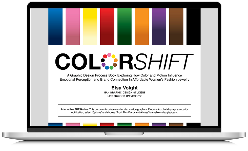
COLORSHIFT: A Graphic Design Process Book Exploring How Color and Motion Influence Emotional Perception and Brand Connection in Affordable Women's Fashion Jewelry
DEGREE: Master of Arts - Graphic Design
SCHOOL: Lindenwood University, St. Charles, Missouri (Online)
YEAR COMPLETED: 2026
ROLE: Researcher, Brand Strategist, Graphic Designer, Creative Director
TOOLS: Adobe Creative Cloud, Qualtrics
Project Overview
ColorShift is a master's thesis project that investigates how color and motion influence emotional perception and brand connection within a women's fashion jewelry brand. Using the fictional mid-range jewelry brand Quanta & Co., this research explores how nine distinct color palettes impact audience perceptions while maintaining a consistent visual identity system. Through branding, motion design, quantitative audience research, and an interactive digital process book, the project demonstrates how intentional design choices can shape emotional response, strengthen brand recognition, and create meaningful consumer connections across print and digital experiences.
Why I Chose This Project
With over 15 years of professional experience in graphic design across the retail and healthcare industries, I have developed a strong interest in branding, visual identity systems, and strategic design. I chose this project because it allowed me to combine my professional experience in branding with my passion for color theory, visual communication, and consumer perception.
I also intentionally selected the fashion jewelry industry—an area outside of my previous professional experience—to challenge myself creatively, expand my portfolio, and demonstrate my versatility as a designer. Through this project, I aimed to strengthen my strategic thinking, refine my creative process, and further develop my expertise in building cohesive and emotionally engaging brand experiences.
Research
This project was grounded in a comprehensive review of existing literature on color psychology, branding, emotional perception, and motion design. Following Institutional Review Board (IRB) approval, a quantitative research study was conducted to examine how color influences audience perceptions of a brand while maintaining a consistent visual identity system. Participants evaluated multiple color variations of the fictional jewelry brand Quanta & Co., providing insight into how color impacts perceptions of attributes such as trustworthiness, modernity, playfulness, and emotional connection. The findings from this research informed the development of the final interactive process book and contributed to a deeper understanding of the relationship between color, motion, and brand experience.
Building the Brand: Quanta & Co.
Quanta & Co. is a fictional contemporary jewelry brand designed to appeal to consumers seeking modern, versatile pieces for both professional and casual settings. Because this project focuses on how color influences brand perception, I intentionally selected a neutral and adaptable brand name and visual identity to serve as a foundation for experimentation.
The brand development process included extensive research, mood boards, and more than 50 logo concepts. Drawing inspiration from the letter "Q" and minimalist branding systems, I created a clean, contemporary logo designed to remain visually consistent across multiple applications while allowing color to become the primary variable throughout the study.


